The Rebranding of Royal Plus on the 22nd Birthday
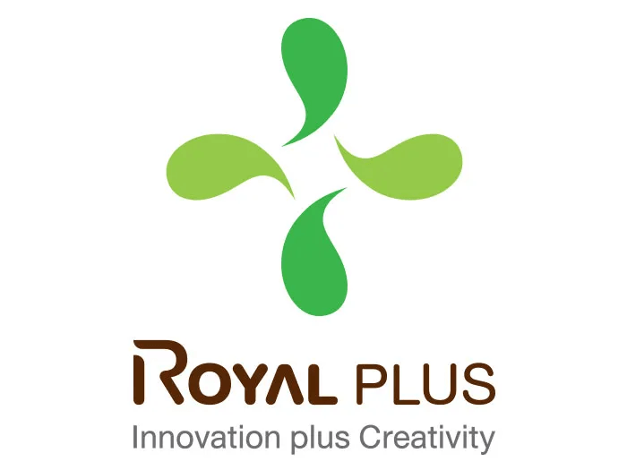
To celebrate Royal Plus’ 22nd birthday and alter our business strategies in accordance to the 22nd year of operation and the business environment that is consistently changing, Royal Plus rebranded. The new logo, that is more vivid, was launched to kick off our rebranding efforts. Two core colors, green and brown, were utilized to construct Royal Plus’ new identity. Green represents coconut – Royal Plus’ signature product – and the sense of rejuvenation from fruit juices which is our core business. Meanwhile, brown symbolizes Thailand’s fertile land – the origin of top quality ingredients used in Royal Plus’ products – and stability. Nonetheless, the water drop symbol that fused into a plus sign represents Royal Plus’ slogan, “innovation plus creativity”, which is a concept of combining innovation and creativity into the manufacturing process to provide happiness to consumers.